People / Izi Thexton
Izi Thexton is a graphic designer with a passion for print, publishing, textiles, and above all, process. Her practice does not revolve around a single medium, but is often led by a love of hands-on making. This pushes her to interrogate production methods and experiment with unfamiliar techniques, which she applies to her work as a publication and exhibition designer in London.
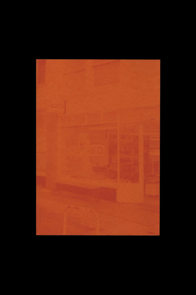
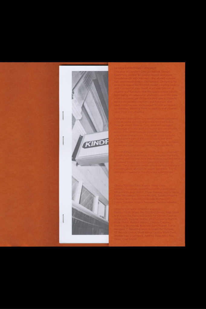
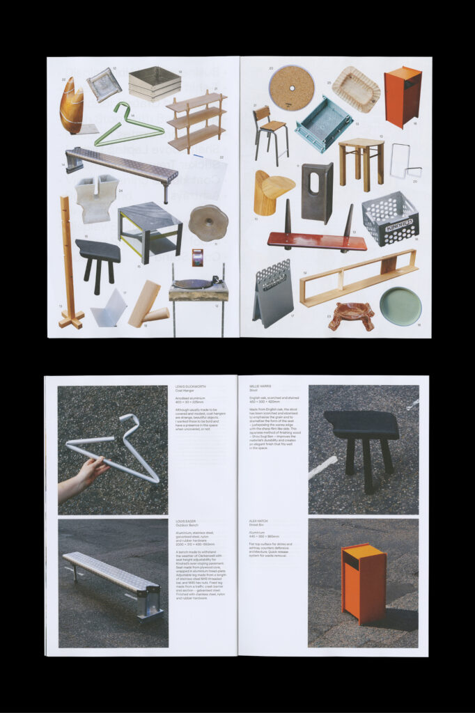
Design Everything x Kindred publication (2024)
Available for purchase via the DE shop
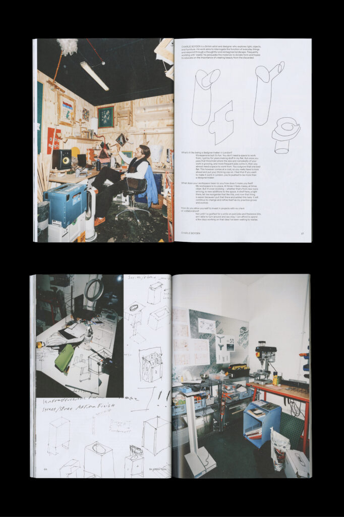
For the design of the book that documents this exhibition, I was initially inspired by the inventive use of metal accents within Kindred’s space, and different use of DIY / available materials. I particularly love the t-shirt rail made out of a length of motorbike exhaust pipe, held up with meat hooks. Stab binding with staples then felt appropriate – something that feels standard, but with a twist. We gave the bindery free rein to position the 3 staples along the spine of the book, making each copy a little different.
The book is set in Roobert by Displaay – a typeface with a direct link to music. Roobert draws inspiration from the Moog logotype, and is named after its founder, Robert Moog, who invented the Moog synthesiser along with many other contributions to the world fo electronic music. On a more visual basis, I also love the curving right angles of the descenders on the lowercase ‘g’s, and of the commas and apostrophes. These forms sort of echo the method of bending pipes that some of the designers utilised for their objects – for example in Lewis’ coat hangers.
The layout and grid of the book takes cues from the structure of the Design Everything logo, designed by George Boyce. The logo utilises modular blocks to create the ‘D-E’ initials of the project’s name, which made for a perfect way to divide up the page! George also crafted the display typeface out of this concept, which can be seen on the back cover and titles of Harry Smithson’s contribution, and Jake Martin’s interview.
Big thanks to Jonny Lee for taking the most stellar photos of the designers’ workspaces and portraits, that made this book a joy to design!
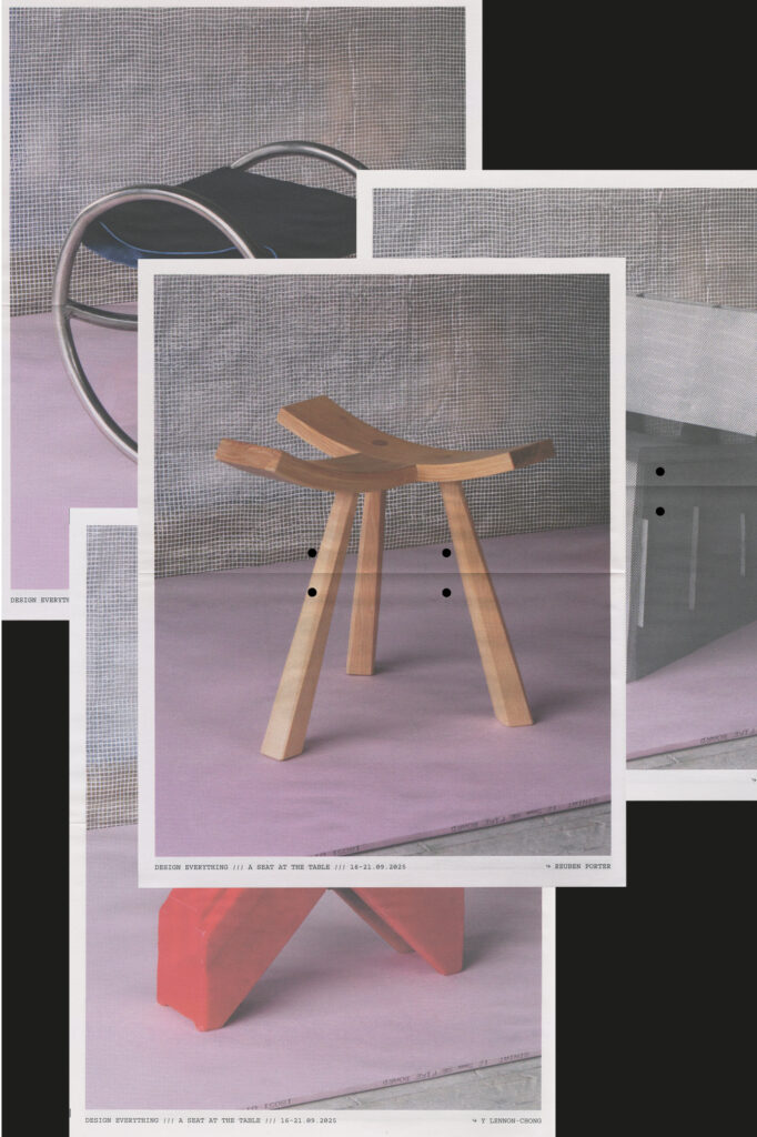
Design Everything: A Seat at the Table publication (2025)
Available for purchase via the DE shop
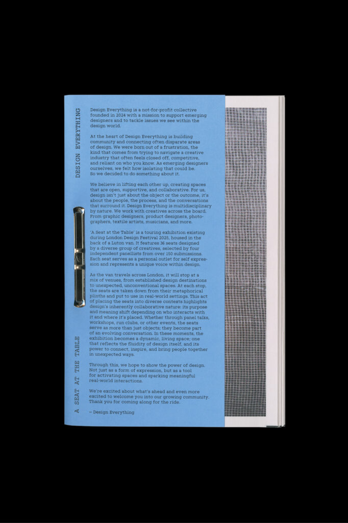
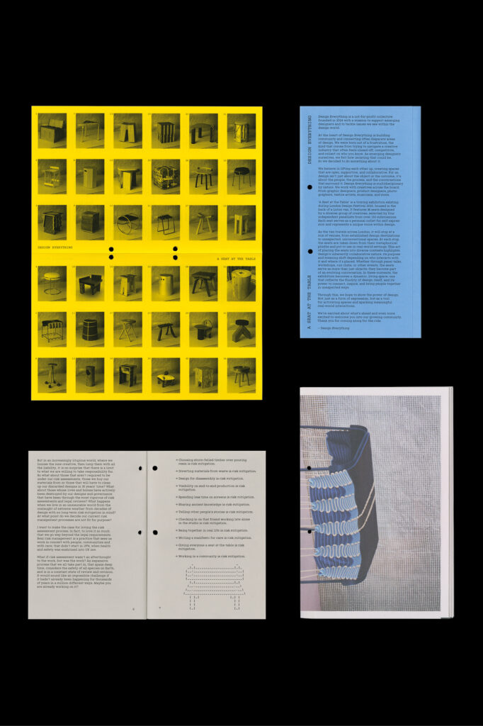
The book documents and records the work of 36 designers from the 2025 Design Everything exhibition. Designers were asked via open call to create a seat within 450 × 450 × 450mm dimensions, which were then housed in a kitted-out Luton van and driven around London in a travelling exhibition.
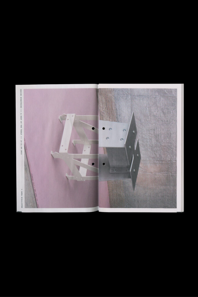
Over the course of the week, the chairs were packed and unpacked from the van, becoming both the subject and the support for community-oriented events such as workshops, talks and discussions. The publication riffs off this, as an amalgamation of elements from the exhibition that can be folded and unfolded, taken apart, reshuffled, and packed back together again.
Each sheet of the publication is an individual poster of one chair, folded in half and compiled to create unexpected combinations from the seats and legs of another. Every copy of the book is put together in a different order, creating different combinations of the chairs and alternating the covers.
The book also features an essay by Vicky Hayward, entitled ‘Risky Business’, which is illustrated with typographic drawings, using the monospace cut of Jack Niblett’s typeface Messenger (Beta).
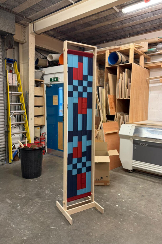
Wayfinding banner made for the ‘A Seat at the Table’ exhibiton.
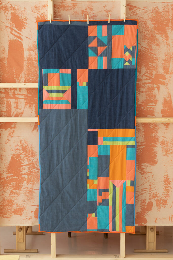
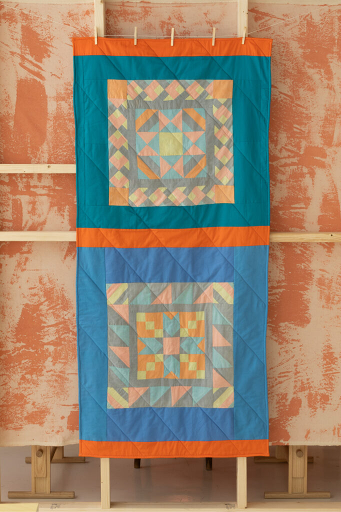
Quick Quilt
With quilting, the initial process of cutting the blocks of fabric very precisely to shape and size can be time-intensive. I was involved in setting up this exhibition, and only have access to a sewing machine at my parents’ house across London, leaving a small window to make something for the show.
Keen to minimise the time choosing, sourcing, buying and cutting fabric, I turned to spare material from past projects that my Mum and I had already. In a drawer of scrap material, I found a pair of quilted cushion covers my Mum made which had faded in the sun.
I found off-cut material from the project that was unbleached – some pieces were strangely shaped offcuts, others were already pieced together and sewn in places. I decided to use these as features of the design, making the old process visible.
The result is a quilt made entirely from existing material, featuring the original cushion cases on the back, and a design made from the remnants of past processes on the front.